Revision Info: Documentation for ARchi VR Version 3.5 - May 2026
Table of Contents
Up to ARchi VR Content Creation
Up to ARchi VR Content Creation
The ARchi VR data model consists of four main classes of elements:
Each model element has a class, a type, and a subtype that define its role and behaviour.
Available AR elements of ARchi VR are presented as class hierarchy diagram in Classification of Model Entities.
All captured spaces (single rooms and merged multiple rooms) are stored on the iOS device in the app container as AppData/Documents/rooms.json file.
This JSON file contains a list of all captured rooms. A sample data structure of a room is meetingroom.json.
Each room additionally contains meta data such as
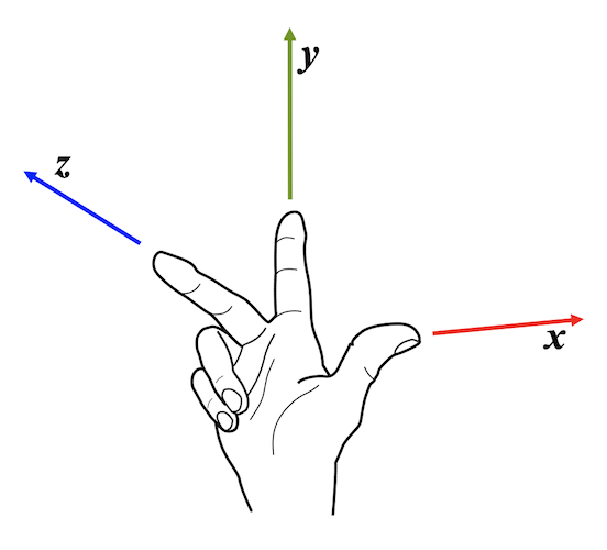
Spatial parameters - such as positions, vertices, or wxdxh - are interpreted according to a right-handed coordinate system (see pictures) and are measured in meters (metric system). Rotation along the x-y-z axes are also right-handed in the sense of rotation is indicated by curling the fingers of your right hand about the axis denoted by your thumb. By looking from top to the floor a rotation along the y-axis is therefore counter-clockwise (CCW) and not clockwise (CW) as in compass bearing.

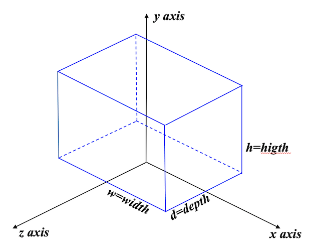
The visual representation of model elements are defined based on their local coordinate system. Within the right-hand rule convention to define the local coordinate system a model element is by default centered around the y-axis in the x-z plane. The element sits on the x-z plane and its front is facing towards the z-axis. Width, hight and depth (wxhxd) dimensions of an element are interpreted within the x-y-z axes of the local coordinate system (see picture).
| Coordinate Systems | Local Object Coordinates | AR Session Coordinates | Global World Coordinates |
|---|---|---|---|
| Measurement | meter | meter | decimal degrees |
| Direction | right-hand ruled x-y-z with x=right, y=up, z=front | right-hand ruled x-y-z, y=up, z pointing to south | latitude and longitude, (0.0 0.0) = 0° 0' 0'' N 0° 0' 0'' E |
| Orientation | front-facing towards z direction | by relative position of vertices | by decimal degrees |
| Localizing | none | via point cloud registration | via GPS |
| Reference | origin at (0, 0, 0) | origin (0, 0, 0) at device location where registration started | origin (0.0, 0.0) at equator line and Greenwich meridian |
| Accuracy | exact in mm or better | +/- a few cm, +/- several degrees in north alignment | +/- a few meter |
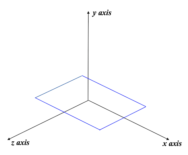
The origin (x=0, y=0, z=0) of the AR session coordinate system within a room is the device position when capturing started. The y-axis is the up vector. The z-axis points towards south, therefore the negative z-axis points towards the north direction.
Be aware of the south orientation of the z-axis in the AR session coordinate system. This means that the top normal of horizontal planes (such as image panels laying on the floor) with y-rotation = 0 are pointing towards north. Horizontal planes are vertical planes that are layed down to the back by rotating it at the x-axis by -90 degrees in the local coordinate system. Horizontal planes are by default centered at (0, 0, 0) within the x-z plane.

If you want to point a route item towards north (e.g., an arrow or pointer) and it is defined in its local coordinate system along the z-axis, then turn it by 180 degrees.
Items are described using a list of 3D vertices. The number of vertices depends on the type of model elements:
By capturing walls and openings (doors, windows) within the ARchi VR app, the vertices of these elements are recorded as dimensions in the AR session coordinate system. All vertices are therefore relative to the origin of the AR session coordinate system which is the device position when capturing started. This means when the device was able to register itself (its position and orientation) within the point cloud of reognized feature points (calculated by the camera's video stream showing the space you are in).
Vertices of Item elements are also recorded in the AR session coordinate system and define thereby their position as well as their orientation (rotation).
The subtypes of a space are:
    "Single Room",
    "Multiple Rooms", // e.g., appartment
    "Outdoor Area",
    "undefined"
The subtypes of a wall element are:
    "Outer Wall",
    "Inner Wall",
    "Partition Wall",
    "Glass Partition",
    "Curtain Wall", // non-structural outer wall utilized to keep the weather out
    "undefined"
The subtypes of a door cutout are:
    "Door Opening",// Opening
    "Door LH",     // Left Hand (opens to outside)
    "Door LHR",    // Left Hand Reverse (reverse = opens to inside)
    "Door RH",     // Right Hand
    "Door RHR",    // Right Hand Reverse
    "Door D",      // Double Swing
    "Door DR",     // Double Reverse
    "Door LS",     // Left Slide
    "Door RS",     // Right Slide
    "Door DS",     // Double Slide
    "undefined"
The subtypes of a window cutout are:
    "Window S",    // Single (or Small)
    "Window D",    // Double
    "Window T",    // Triple
    "Window SB",   // Single with center bars
    "Window DB",   // Double with center bars
    "Window TB",   // Triple with center bars
    "Window SO",   // Single with overlight
    "Window DO",   // Double with overlight
    "Window TO",   // Triple with overlight
    "Window VS",   // Vertical Sliding
    "undefined"
The subtype of the floor element defines the room type. These subtypes are:
    "Auditorium",
    "Balcony",
    "Bathroom",
    "Bedroom",
    "Cave",
    "Classroom",
    "Conference Room",
    "Corridor",
    "Dining Room",
    "Dressing Room",
    "Equipment Room",
    "Family Room",
    "Garage",
    "Garden",
    "Hall",
    "Home Office",
    "Kitchen",
    "Laundry Room",
    "Lobby",
    "Living Room",
    "Meeting Room",
    "Nursery",
    "Office",
    "Open Space",
    "Studio",
    "Utility Room",
    "undefined"
An item element is defined by the following data structure:
{
    "type": "Spot",     // item type
    "subtype": "Panel", // item subtype
    "id": "_",          // item UUID, set by app when created interactively
    "name": "",         // optional: item name or title
    "mvertices": [],    // set by app: measured vertices as list of [x y z] interpreted as pos, line, polyline, or bounding box
    "vertices": [],     // vertices, calculated from mvertices to be aligned
    "asset": "",        // optional: can be URL to (img or 3d) file OR (directly embedded) rich-text/html code
    "attributes": "",   // optional: visualization attributes for asset
    "content": "",      // optional: text (description, message) or URL to content (html) for enhancing item
    "isLocked": false,  // optional: disables move & rotate interaction
    "setup": "",        // optional: URL to an action for setup of children and behaviour by dispatched tasks
    "children": "",     // optional: comma-separated list of item IDs (defined in setup action)
    "spaceId": "_id",   // set by app: single room space UUID the item belongs to
    "anchorId": "_id",  // set by app: id of floor, wall or other item this item is attached to
    "scope": "private", // set by app: "private", "shared", or "public"
    "ownerId": "_id"    // set by app: ID of creator/owner of this item
}
Items can be of the following types:
    "Spot",      // point, POI (point of interest), marker, anchor
    "Route",     // line, multi-line path
    "Zone",      // horizontal area
    "Geometry",  // basic geometry primitives
    "Picture",   // vertical rectangular image area, loaded from asset URL
    "Building",  // immobile element that belongs to building structure
    "Equipment", // immobile, stationary equipment
    "Interior",  // furniture
    "Commodity", // daily used item
    "Data",      // 3D data input/output element
    "Avatar",    // representation of creature
    "Overlay"    // 2D overlay element on top of AR view
A good way to get the data structure with the specific data values of an item type is to interactively create it within ARchi VR and then analyze the generated JSON code of the item. There are several options to get access to the generated JSON data:
AppData/Documents/rooms.json fileThe attributes are defined like HTML attributes separated by semicolon.
    {
         "attributes": "wxdxh:0.4x0.0x0.4;billboard:1;color:yellow;",
    }
Some items can change color or background color. The color is specified in attributes using HTML-like color specifications:
    {
         "attributes": "color:blue; bgcolor:#FF0000AA;",
    }
In order to orient a visual node of an item to always stand upright, set the uprightattribute to 1.
    {
         "attributes": "upright:1",
    }
In order to orient a visual node of an item to always point toward the current camera, set the billboardattribute to 1. This will automatically adjusts a node’s orientation so that its local z-axis always points toward the user. This might for example be useful for text and image panels to keep them always readable/visible.
    {
         "attributes": "billboard:1",
    }
Only one spatial constraint can be active on a item, therefore do not specifiy upright and billboard together.
Other attributes are depending and only valid on certain item type and subtypes and are described in the corresponding subsections below.
See ARchi VR Assets for instructions on how to create and convert media assets.
Rich-text formatting is supported by HTML tags such as:
<h1> header 1, <h2> header 2, <h3> header 3<b> bold, <i> italic, <br> line break<p style="color:red;text-align: center;"> paragraph styles<ol> ordered list, <ul> unordered list, <li> list item<sub>subscript, <sup> superscript, <u>underline, <del>strike<a href="url"> link {
"asset" : "<h2>Yeah!</h2> This is very<br><b>nice</b> indeed!",
}
If no <style>tag is included, a default html page setup is used.
Otherwise you may provide your own full HTML declaration.
Image and video assets can be used as texture maps with Spot:Panel, Geometry:Plane, and with Overlay:Image or Overlay:Video.
    {
         "asset" : "https://service.metason.net/ar/extension/images/stop.png",
    }
A file referenced by asset for an image should be in one of the following formats:
A file referenced by asset for a video should be in one of the following formats:
A file referenced by asset for a 3D model should be in one of the following formats:
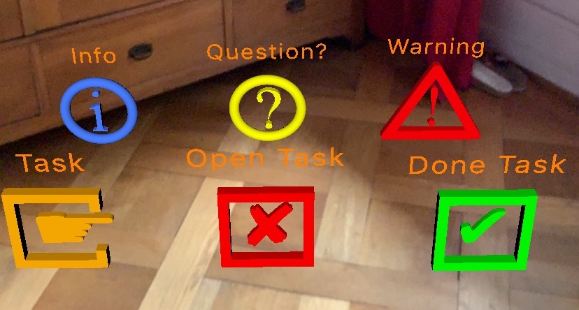
The subtypes of spot items are:
    "Info",      // with info icon
    "Question",  // with question mark icon
    "Warning",   // with warning icon
    "Task",      // repair task, care task
    "Open Task", // unsolved task
    "Done Task", // solved task
    "Pointer",   // text with pointer
    "Text",      // text only without 3D icon
    "Panel"      // image or multi-line text with background panel
A spot item is spatially defined by one vertex as an anchor point, and optionally with a second vertex to specify its orientation along the y axis.
Example of a spot item (e.g., as used in an AR action):
    {
        "id": "com.company.archi.attention",
        "vertices": [
            [
                -0.2,
                0.0,
                -1.0
            ]
        ],
        "type": "Spot",
        "subtype": "Warning",
        "name": "Attention",
        "isLocked": true
    }
If"subtype": "Panel" is declared, the spot item is either a text panel, an image panel, or a video panel. A text panel may include embedded HTML in the "asset" parameter to define styled text. You may also define color (font color) and bgcolor (background color) in attributes.
    {
        "id": "com.company.archi.textpanel",
        "type": "Spot",
        "subtype": "Panel",
        "name": "Text Panel",
        "vertices": [
            [
                0.0,
                0.0,
                0.0
            ]
        ],
        "asset": "<b>Hello</b><br>Welcome to ARchi VR.<br><small><i>Augmented Reality</i> at its best.</small>",
        "attributes": "color:#DDCCFF;bgcolor:#333333DD;scale:1.0"
    },
    {
        "id": "com.company.archi.imgpanel",
        "type": "Spot",
        "subtype": "Panel",
        "name": "Img Panel",
        "vertices": [
            [
                0.0,
                0.0,
                0.0
            ]
        ],
        "asset": "https://service.metason.net/ar/content/signs/img/general_warning.png",
        "attributes": "wxdxh:0.4x0.0x0.4;billboard:1"
    }
The following screen shot shows a text panel and two (interactive) image panels:

A video referenced in "asset" will be looped during the AR session.
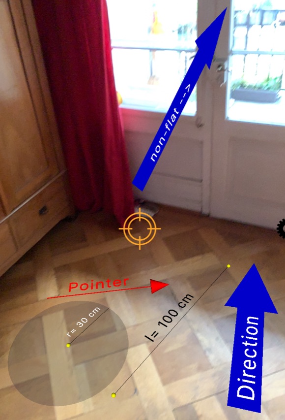
The subtypes of a route item are:
    "Distance", // measure
    "Pointer",
    "Direction", // arrow
    "Radius",
    "Line",
    "Polyline", // hairline, add first point at end of vertices list in order to close polyline
    "Polylink", // line with width, add first point at end of vertices list in order to close polyline
    "Pipe", // drawing path
    "Trail", // walking trail
    "undefined"
A route item is spatially defined by two vertices as from-to points.
Example of a Route item (e.g., as used in a Service extension):
    {
        "id": "com.company.archi.exit",
        "vertices": [
            [
                0.0,
                0.0,
                0.0
            ],
            [
                0.0,
                0.0,
                0.75
            ]
        ],
        "type": "Route",
        "subtype": "Direction",
        "name": "Exit"
    }
If "name" is empty, Distance and Radius items will show per default their measure in cm, otherwise the name string will be displayed.
Route elements typically have fixed default colors. For example, arrows of "subtype": "Direction" are blue with white text by default, but their appearance can be overridden with color (font color) and bgcolor (background color):
"attributes": "color:#00FFFF; bgcolor:#FF0000;"
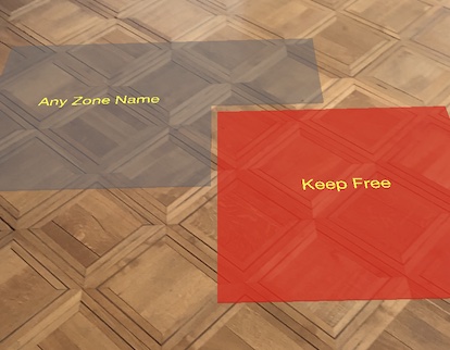
The subtypes of a zone item are:
    "Carpet",
    "Keep Free",
    "Entry",
    "Gangway",
    "Lane",
    "Lawn",
    "Pool",
    "Parking",
    "Damaged Area",
    "Named Area",
    "Object Footprint",
    "undefined"
A zone item is spatially defined by at least three vertices in a plane. The last vertex will be connected to the first one to close the zone area.
The subtypes of geometry item are:
    "Arc",
    "Arrow",
    "Box",
    "Capsule",
    "Circle",
    "Cone",
    "Cube",
    "Cylinder",
    "Group",
    "Line",
    "Octahedron",
    "Plane",
    "Prism",
    "Pyramid",
    "Sphere",
    "Star",
    "Torus",
    "Triangle",
    "Tube",
    "Light"
An example of a geometry item (e.g., as used in a Service extension):
"items": [
    {
        "id": "sample.box",
        "type": "Geometry",
        "subtype": "Box",
        "attributes": "color:#FF0000; wxdxh: 0.5x0.9x0.5; ratio:0.15",
    }
]
These geometry items support the generation of corresponding 2D and 3D visualizations.
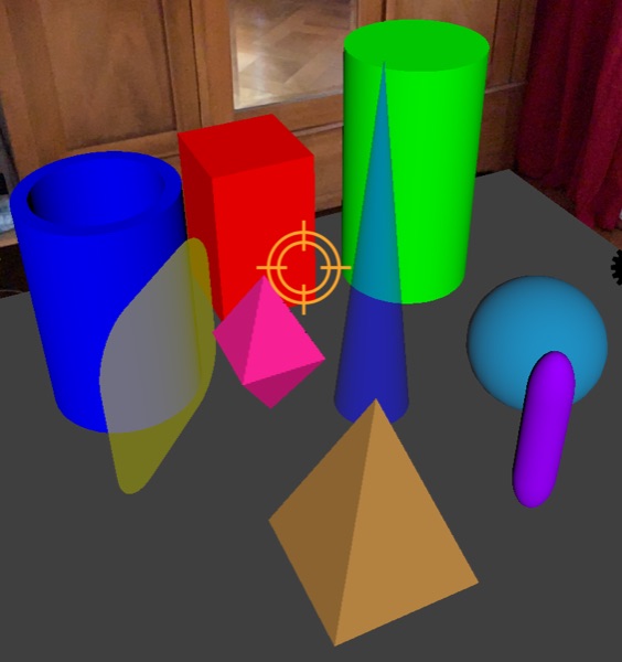
Except for Line, Light, Spot and Group, the geometric representation is generated within the bounding box defined by wxdxh (width, depth, height = x, z, y dimensions). It is centered in the x-z-plane, and sits on the floor level (y = 0) of the local object coordinate system. If vertices contains one point (besides the wxdxh spcification) then the element is shifted accordingly while the pivot stays at the local (0, 0, 0) center.
The Line geometry is defined by its vertices and can therefore be a multi-line item showing multiple line segments as connected path.
For Group see Grouping of Items
Some geometry items can define a ratio in attributes such as "ratio:0.25" that defines the relation between:
For a Star item you can specify "rays:7" in attributes.
For a Prism item you can specify "sides:5" of regular polygon in attributes.
The color of a geometry item can be defined using HTML color specifications within attributes:
Another sample of a geometry item:
    {
        "id": "com.company.archi.point",
        "type": "Geometry",
        "subtype": "Sphere",
        "attributes": "color:yellow; wxdxh:0.025x0.025x0.025",
        "vertices": [
            [
                0.0,
                -0.0125,
                0.0
            ]
        ]
    }
Because the wxdxh spcification will place the geometry on the floor level (y = 0), the point in vertices will shift the center of the sphere back to (0, 0, 0).
To change position and orientation of a Geomatry item within its local coordinate system, use x:0.5;y:1.0;z:-3 attributes in meters and rx:90;ry:180;rz:45 attributes in degrees.
A Plane geometry can be textured by an image or a video defined as URL in `"asset".
Catalog items allow you to place custom models located in the URL in asset. Such a model may be part of a Catalog or be provided separately as a model on a Web server. Models may be generated from 3D files, from image files, or by Actions in JSON format. See more details in the Catalog chapter.
Hint: If asset URL points to a 3D file, then "type": "3D Object" must be set!
    {
        "id": "com.company.archi.officechair",
        "asset": "https://archi.metason.net/catalog/3D/Office%20Chair.scnz",
        "attributes": "wxdxh: 0.6x0.5x0.8;scale: 0.01;",
        "type": "3D Object",
        "subtype": "Chair",
    }
To change position and orientation of a Catalog item within its local coordinate system, use x:0.5;y:1.0;z:-3 attributes in meters and rx:90;ry:180;rz:45 attributes in degrees.
The subtypes of a building item are:
    "Column", // pillar
    "Round Column",
    "Platform", // podium
    "Rail", // guardrail, handrail, balustrade
    "Stairs",
    "Wall", // free wall
    "Glass Partition",
    "undefined"
These items support the generation of corresponding 2D/3D visualizations.
The subtypes of an interiour item are:
    "Stool",
    "Chair",
    "Couch", // Sofa
    "Desk",
    "Table",
    "Bed",
    "Shelf",
    "Cabinet",
    "Kitchen",
    "Curtain",
    "Lamp",
    "Floor Lamp",
    "undefined"
The following items support the generation of corresponding 3D/VR visualizations:
All other items are visualized in 2D and 3D with their bounding box.
The subtypes of data items are:
    "Label",        // text label
    "Lamp",         // on/off lamp
    "Level",        // linear gauge
    "Needle",       // radial gauge: rotating needle
    "Arc",          // radial gauge: rotating arc
    "Viz",          // data visualization item
    "Switch",       // interactive toggle switch
    "Slider",       // interactive slider / fader
    "Knob"          // interactive rotaty knob
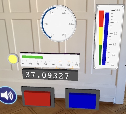
A Data item is spatially positioned like a Spot item by one vertex as an anchor point (centered), and optionally with a second vertex to specify its orientation in y direction.
The wxdxh settings within attributes are used for defining the visual representation of a Data item. If h < d then the element lays flat, otherwise it is standing up. The visual representation is sitting on the x-z plane, when standing (so not flat) the back of the element is addionally within the x-y plane.
The value of a data item can be accessed by the getValue function.
The value of a data item is set by the setValue function.
If "subtype": "Label" is declared, the data item is a text label.
    {
        "id": "com.company.archi.label",
        "type": "Data",
        "subtype": "Label",
        "name": "HH:mm.ss",
        "vertices": [
            [
                0.0,
                0.0,
                0.0
            ]
        ],
        "attributes": "wxdxh:0.3x0.0x1.0;color:#DDCCFF;bgcolor:#333333DD;font:Courier;"
    }
The data range of the update function is any string.
The height in "wxdxh" is defining the height of the text label if it is horizontally aligned, otherwise it is flipped to the normal of the longest dimension.
If "bgcolor" is defined, a background panel will be added to the text label. The length of the string set in "name": "___" defines the default width of the panel.
If "subtype": "Lamp" is declared, the data item is an indicator lamp.
    {
        "id": "com.company.archi.lamp",
        "type": "Data",
        "subtype": "Lamp",
        "vertices": [
            [
                0.0,
                0.0,
                0.0
            ]
        ],
        "attributes": "wxdxh:0.03x0.0x0.03;color:#FFCC00;bgcolor:#AAAAAA;ratio:0.8;value:YES;"
    }
The data range of the update function is 0/false//NO or 1/true//YES.
The ratio in attributes such as "ratio:0.8" defines the relation between innerRadius: outerRadius. value:1 is used to set the initial value.
If "subtype": "Level" is declared, the data item is a linear gauge.
    {
        "id": "com.company.archi.level",
        "type": "Data",
        "subtype": "Level",
        "vertices": [
            [
                0.0,
                0.0,
                0.0
            ]
        ],
        "asset": "_imgURL", // background image
        "attributes": "wxdxh:0.01x0.4x0.0;color:#DDCCFF;ratio:0.7;dx:0.1;dy:01;value:025;"
    }
The data range of the update function is from 0.0 to 1.0.
The ratio in attributes such as "ratio:0.7" defines the relation between level length and full length (depending on main direction). "dx" and "dy" define the relative shift to the center. Use an image URL in asset to set a gauge background.
If "subtype": "Needle" is declared, the data item is a radial gauge showing a needle as indicator.
    {
        "id": "com.company.archi.needle",
        "type": "Data",
        "subtype": "Needle",
        "vertices": [
            [
                0.0,
                0.0,
                0.0
            ]
        ],
        "asset": "_imgURL", // background image
        "attributes": "wxdxh:0.15x0.15x0.0;color:#DDCCFF;ratio:0.7;start:-0.85;dx:0.0;dy:02;value:-0.1;"
    }
If "subtype": "Arc" is declared, the data item is a radial gauge displaying an arc bow as indicator.
    {
        "id": "com.company.archi.arc",
        "type": "Data",
        "subtype": "Arc",
        "asset": "_imgURL", // background image
        "attributes": "wxdxh:0.15x0.15x0.0;color:#DDCCFF;ratio:0.7;thickness:0.1;dx:0.0;dy:02;start:-0.75;"
    }
The data range of Arc and Needle items goes from -1.0 to +1.0, with 0 at North position and going clockwise. It is up to you to calculate the starting min value of the arc or needle and its max value. Min and max value vary depending on the gauge background image that is applied.
The ratio in attributes such as "ratio:0.7" defines the relation between indicator radius length and full radius (half width). The "thickness" attribute specifies the width of the arc relative to the full radius. "dx" and "dy" define the relative shift of the indicator to the center. Use an image URL in asset to set a gauge background.
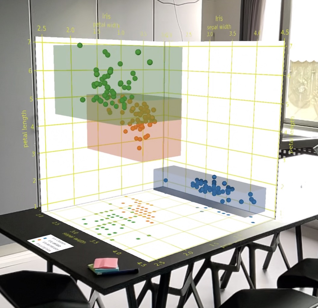
If "subtype": "Viz" is declared, the data item will display a data visualization with content that is declared in the asset file. This file contains data representations as defined by and generated with the python library SAXR (Situated Analytics in eXtended Reality, https://github.com/metason/SAXR).
    {
        "id": "com.company.archi.viz",
        "type": "Data",
        "subtype": "Viz",
        "asset": "_viz.json", // data rep file
        "attributes": "value:2"
    }
The value key within attributes defines the data viz scene to display on initialization.
Currently the ARchi VR App supports the following interactive data items: Switch, Slider, and Knob. There behavior is defined by their "content": "on:tap=function(...)" or the "content": "on:drag=function(...)" specifications. The event listeners should also set the value of the data item that is triggering them.
    {
      "id": "net.metason.archi.switch",
      "type": "Data",
      "subtype": "Switch",
      "isLocked": true,
      "content": "on:tap=toggle('data.boolVal');setValue('net.metason.archi.switch', 'data.boolVal');",
      "attributes": "wxdxh:0.3x0.04x0.2;color:#FF0000;bgcolor:#555555;ratio:0.78;value:false;"
    }
The ratio in attributes such as "ratio:0.7" defines the ratio of buttton size : full size (border as housing).
    {
      "id": "net.metason.archi.knob",
      "type": "Data",
      "subtype": "Knob",
      "content": "on:drag=setValue('net.metason.archi.knob', 'event.value');",
      "isLocked": true,
      "attributes": "wxdxh:0.2x0.2x0.18;color:#0000FF;value:0.25;min:-0.75;max:0.75;"
    }
The data range of a Knob item goes from -1.0 to +1.0, with 0 at North position and going clockwise. Restrict this range by the min and max values.
    {
      "id": "net.metason.archi.slider",
      "type": "Data",
      "subtype": "Slider",
      "name": "Slider",
      "content": "on:drag=setValue('net.metason.archi.slider', 'event.value');",
      "isLocked": true,
      "asset": "https://service.metason.net/ar/content/images/gaugelinear.png",
      "attributes": "wxdxh:0.5x0.03x0.12;color:#00EE00;bgcolor:#111111FF;ratio:0.3;dx:0.022;dy:0.03;min:0.0;max:1.0;value:0.3;"
    }
The ratio in attributes such as "ratio:0.3" defines the ratio of knob width : slider width.
Overlay items are placed on top of the AR view. They can be used to present information and additionaly be interactive.
The subtypes of overlay items are:
    "Label",        // simple text
    "Text",         // multi-line rich text
    "Button",       // tinted button with rounded corners
    "Image",        // image
    "Video",        // showing video stream
    "Indicator",    // label with arrow to center of area
    "BBoxLabel",    // bounding box with label at top
    "Toggle",       // toggle switch without label
    "Menu",         // Pop-up menu selector
    "Selector",     // Segment selector
    "Color",        // Color picker
    "WebView"       // web page
Video overlays will start automatically and will be removed after ending.
Menu and Selector overlays are presenting the list of comma-separated strings defined in assets,
getValue/setValue are addressing their index.
The Color overlay shows a color well opening a color picker. The selected color can be set and grabbed by
the color function.
Be aware that placing overlays has to work on different screen sizes (of various models of iPhones and iPads) as well as in landsape and portrait mode. Therefore the placcement of overlay items is supported by constraints relative to the bounds of the AR view.
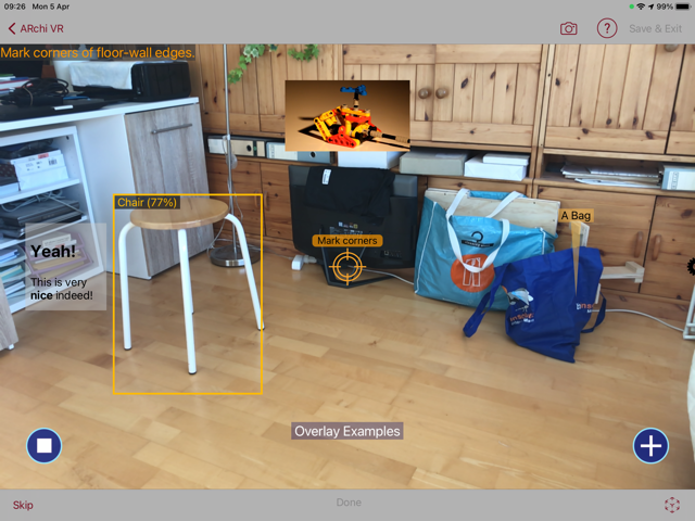
The arrangement of 2D overlays on the AR view is specified by layout attributes in pixels:
left: distance from left border (in x direction)top: distance from top border (in y direction)right: distance from right border (in x direction)bottom: distance from bottom border (in y direction)cx: +/- distance from horizontal center alignment (center x)cy: +/- distance from vertical center alignment (center y)width: width of overlaysheight: height of overlayThe following examples are representing the 2D overlay items seen in the above image.
    {
        "id" : "net.metason.archi.overlay1",
        "type" : "Overlay",
        "subtype" : "BBoxLabel",
        "name" : "Chair (77%)",
        "attributes" : "color:#FFBB00;left:310;top:140;width:180;height:362;"
    },
    {
        "id" : "net.metason.archi.overlay2",
        "type" : "Overlay",
        "subtype" : "Label",
        "name" : "Overlay Examples",
        "attributes" : "color:#000000;bgcolor:#88888877;cx:0;bottom:40;width:130;height:120;"
    },
    {
        "id" : "net.metason.archi.overlay3",
        "type" : "Overlay",
        "subtype" : "Image",
        "asset" : "https://service.metason.net/ar/extension/images/stop.png",
        "content" : "on:tap=say('stopped');",
        "attributes" : "left:40;bottom:40;width:60;height:60;"
    },
    {
        "id" : "net.metason.archi.overlay4",
        "type" : "Overlay",
        "subtype" : "Image",
        "asset" : "https://service.metason.net/ar/extension/images/plus.png",
        "content" : "on:tap=say('Yes');",
        "attributes" : "right:40;bottom:40;width:60;height:60;"
    },
    {
        "id" : "net.metason.archi.overlay5",
        "type" : "Overlay",
        "subtype" : "Indicator",
        "name" : "A Bag",
        "content" : "on:tap=say('This is a bag');",
        "attributes" : "color:#000000;bgcolor:#FFBB4477;right:130;bottom:260;width:120;height:240;"
    },
    {
        "id" : "net.metason.archi.overlay6",
        "type" : "Overlay",
        "subtype" : "Text",
        "asset" : "<h2>Yeah!</h2> This is very<br><b>nice</b> indeed!",
        "attributes" : "color:#000000;bgcolor:#CCCCCC77;left:40;cy:0;width:130;height:140;"
    },
    {
        "id" : "net.metason.archi.overlay7",
        "type" : "Overlay",
        "subtype" : "Video",
        "asset" : "https://techslides.com/demos/sample-videos/small.mp4",
        "content" : "on:tap=delete('net.metason.archi.overlay7');",
        "attributes" : "cx:0;top:40;width:200;height:150;"
    },
    {
        "id" : "net.metason.archi.overlay8",
        "type" : "Overlay",
        "subtype" : "Toggle",
        "content" : "on:tap=say('On')|on:tap=say('Off')",
        "attributes" : "bottom:40;right:40;width:40;height:40;"
    }
The internal "Draw on world" feature is using Overlays for creating on-the-fly UI elements.
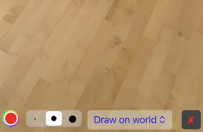
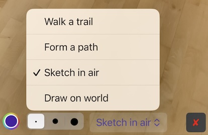
From left to right: A color picker, a size selector, a mode menu, and a cancel button. The following declarations are used to install the 2D overlay items seen in the above image.
    {
       "id" : "my.overlay.color",
       "type" : "Overlay",
       "subtype" : "Color",
       "attributes" : "bottom:10;left:5;width:32;height:32;color:#FF0000;",
       "content" : "on:tap=function(...);"
    },
    {
      "id" : "my.overlay.size",
      "type" : "Overlay",
      "subtype" : "Selector",
      "asset" : "•, ●, ⬤",
      "attributes" : "bottom:10;left:50;width:110;height:32;bgcolor:#EEEEEE66;value:1;",
      "content" : "on:tap=function(...);"
    },
    {
        "id" : "my.overlay.mode",
        "type" : "Overlay",
        "subtype" : "Menu",
        "asset" : "Draw on world, Sketch in air, Form a path, Walk a trail",
        "attributes" : "bottom:10;left:168;width:120;height:32;color:#0000FF;bgcolor:#EEEEEE66;value:0;",
        "content" : "on:tap=function(...);"
    },
    {
       "id" : "my.overlay.cancel",
       "type" : "Overlay",
       "subtype" : "Button",
       "attributes" : "bottom:10;right:5;width:36;height:32;color:#FF0000;bgcolor:#444444;",
       "name" : "✘",
       "content" : "on:tap=remove('my.overlay.*');"
    }
Overlay elements will react on touch when defining the on:tap=... content.
"content" : "on:tap=say('Yes');"
The Toggle overlay may define two functions separated by "|" in the content field.
The first one is exectuted when the switch is turned on, the second when turned off.
raycast('_id')
By calling the raycast function, raycasting will be triggered from the overlay depicted by its id:
The result is a list of hits with a wall or with the floor. Each hit contains the x-y screen coordinates, the x-y-z world coordinates of the hit, as well as the id and type of the hitted item.
The hit list can then be sent to a server by calling:
postHits('https://___')
The hit list will be deleted (reseted) after sending via post.
Example of a raycast hit list: hits.json
Below a declaration of an interactive BBoxLabel that on touch will raycast itself and then sends the generated hit list together with the user position to a server.
    {
        "id" : "my.overlay",
        "type" : "Overlay",
        "subtype" : "BBoxLabel",
        "content" : "on:tap=raycast('my.overlay');postUserHits('https://__');",
        ...
    }
The user data includes the x-y-z world coordinates of the camera (of the device). The vector from the camera position to the hit point defines the ray in the world coordinate system.
The Group subtype of a Geometry item has no visual representation and is used as grouping element for its children items to build a hierarchical scene tree as in the example below. The x: y: z: attributes of children define their position relative to its parent - by default at origin (0, 0, 0) when not specified.
An example of an Action that adds a group with children items:
{
    "$schema": "https://service.metason.net/ar/schemas/action.json",
    "items": [
        {
            "id": "net.metason.archi.box",
            "type": "Geometry",
            "subtype": "Box",
            "attributes": "color:#FFFF00; wxdxh: 0.35x0.01x0.35;x:0.5;"
        },
        {
            "id": "net.metason.archi.line",
            "type": "Route",
            "subtype": "Polyline",
            "vertices": [
                [
                    0.0,
                    0.0,
                    0.0
                ],
                [
                    0.25,
                    -0.2,
                    0.0
                ],
                [
                    0.5,
                    0.0,
                    0.0
                ]
            ],
            "attributes": "color:#FFFF00"
        },
        {
            "id": "net.metason.archi.group",
            "type": "Geometry",
            "subtype": "Group",
            "children": "net.metason.archi.box, net.metason.archi.line"
        }
    ],
    "tasks": [
        {
            "do": "add",
            "id": "net.metason.archi.group",
            "ahead": "0.0 0.8 -1.5"
        }
    ]
}
The "setup" entry is an URL referencing an Action data structure in the JSON format following the "DeclARe" JSON schema. Such an Action can declare children items as well as behavior via corresponding dispatched tasks.
A good example is the analog clock in the "Smart Elements" catalog. It consists of an image panel as background and three Geometry items to represent the hour, minute and second indicators. Each indicator is controlled by a dispatched task to display the current time that is delivered by the time data structure of the App context.
{
    "$schema": "https://service.metason.net/ar/schemas/action.json",
    "items": [
        {
            "id": "net.metason.archi.clockface",
            "type": "Spot",
            "subtype": "Panel",
            "vertices": [
                [
                    0.0,
                    0.0,
                    0.0
                ],
                [
                    0.0,
                    0.0,
                    1.0
                ]
            ],
            "asset": "https://service.metason.net/ar/content/smarts/clockface.png",
            "attributes": "wxdxh:0.36x0.0x0.36;y:-0.18;z:0.001;billboard:0;"
        },
        {
            "id": "net.metason.archi.hourptr",
            "type": "Geometry",
            "subtype": "Plane",
            "attributes": "color:#000000; wxdxh: 0.02x0.0x0.14;y:-0.03;z:0.002;"
        },
        {
            "id": "net.metason.archi.minptr",
            "type": "Geometry",
            "subtype": "Plane",
            "attributes": "color:#000000; wxdxh: 0.02x0.0x0.185;y:-0.03;z:0.003;"
        },
        {
            "id": "net.metason.archi.secptr",
            "type": "Geometry",
            "subtype": "Plane",
            "attributes": "color:#FF0000; wxdxh: 0.005x0.0x0.20;y:-0.04;z:0.004;"
        },
        {
            "id": "net.metason.archi.analogclock",
            "name": "Clock",
            "type": "Geometry",
            "subtype": "Group",
            "vertices": [
                [
                    0.0,
                    0.0,
                    0.0
                ],
                [
                    0.0,
                    0.0,
                    1.0
                ]
            ],
            "setup": "https://service.metason.net/ar/content/smarts/analogclock.json",
            "attributes": "wxdxh:0.36x0.01x0.36;",
            "children": "net.metason.archi.clockface, net.metason.archi.hourptr, net.metason.archi.minptr, net.metason.archi.secptr"
        }
    ],
    "tasks": [
        {
            "as": "repeated",
            "each": "1",
            "do": "execute",
            "op": "rotZ('net.metason.archi.secptr', -(time.sec*const.pi)/30.0)"
        },
        {
            "as": "repeated",
            "each": "5",
            "do": "execute",
            "op": "rotZ('net.metason.archi.minptr', -(time.min*const.pi)/30.0)"
        },
        {
            "as": "repeated",
            "each": "5",
            "do": "execute",
            "op": "rotZ('net.metason.archi.hourptr', -(time.hour*const.pi)/6.0 - (time.min*const.pi)/360.0)"
        }
    ]
}
Back to ARchi VR Content Creation
Copyright © 2020-2026 Metason - All rights reserved.